

scholarjet
Roles
UX/UI Researcher and Designer
Duration
October 2019 - February 2020
Tools
Figma, Zeplin
Team
Product manager, Two Software Engineers

The Challenge
ScholarJet has redesigned their business strategy, going from focusing on diversity in scholarships to entry-level jobs. With this, their platform for recruiters has never changed and they have found recruiters aren’t hiring their candidates. I needed to solve how to make the recruiter experience simpler and intuitive to help them reach their ultimate goal of hiring from ScholarJet’s diverse community of candidates.

discovery research + analysis
I began with user research interviews to scope out what was needed to make the recruiters goals of hiring a more seamless experience. I then organized the research picking out themes through affinity mapping. From these themes I wrote questions on how I might solve certain pain points that arrived from the affinity mapping. Then I performed a brainstorming session on features that would solve these questions. I prioritized these features based on the complexity and value of each feature.


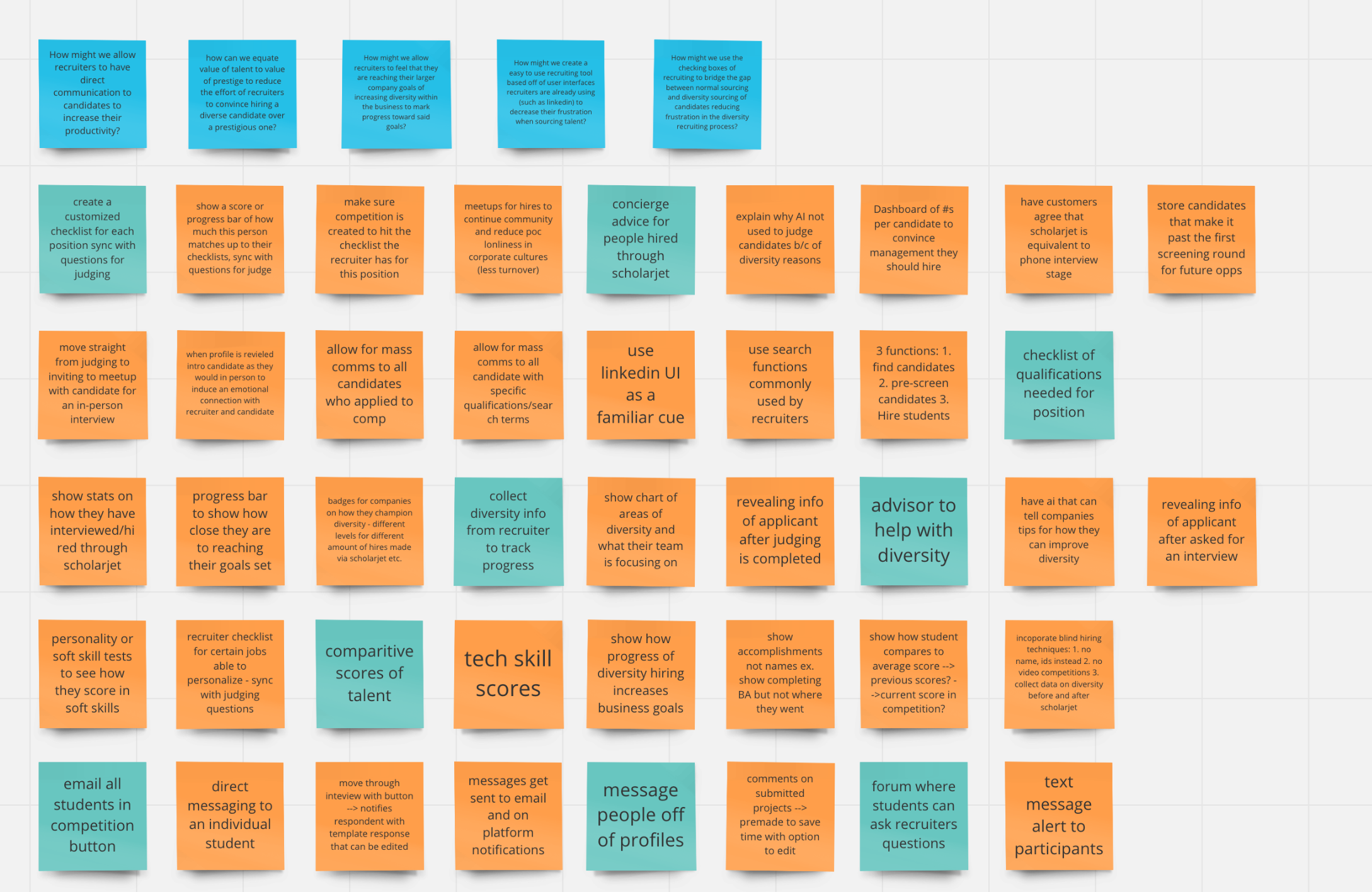


Design: Concepts & Sketching
Then I sketched out these ideas, coming up with many different versions. I picked the one I liked best based off of user’s needs and created a lo-fi prototype. I then created a user flow to pull tasks that I wanted users to be able to perform based off of needs found in the initial user research.


From this prototype I performed usability testing to see any errors that might come up in the flow of tasks. I then redesigned a lo-fi prototype with updates that came up in the useability test. From these new designs I then created a hi-fi prototype.


Prototype
I came to our designs by using UI and features that recruiters are used to. LinkedIn recruiter is a major player in their daily life, and using some of the key features that they offer such as mass messaging and filtering based off of certain checks they are looking for that is key to making a recruiter’s daily recruiting process easier. They also needed a way to communicate simply, moving from judging to interviewing quickly. I also know that bias is there and withholding some identifying information about the candidate until after judging is important to remove the recruiter’s implicit bias allowing them to succeed in their diversity goals. Lastly, I added inspiration on why diversity is important to remind the recruiter of their company goals and why they are putting the effort into reaching out to these particular candidates.


Validation and Testing
I have created a Google HEART requirements to evaluate the performance of our redesign.

Usability findings
Tasks to Test
Task 1: Successfully judge a un-judged candidate and invite them for an interview.
Task 2: Find a previously judged candidate and message them.
Task 3: Select the top two candidates on the candidate page and invite them to an interview.
Task 4: Create a new hiring competition for your company.
Data
Task 1
Task success: 42% did not pass
Notes:
People confused that there was no signal that task was completed
Not clear to him that the questions were different in flow
Hard to find where it started, one person so frustrated they left
"All look un-judged I think", clear signals for un-judged/judged or should be part of
On-boarding needed
"Helpful to know how many steps there are" in judging
Would like a back button after judging process
Task 2
Task success: 29% did not pass
Notes:
Thought messaging was where he could find candidates (which is true in reg but
not on prototype).
Confused that photo of other girl is on message of this girl create separate flow.
Thought messaging was where he could find candidates (which is true in reg but not on prototype)
Confused that photo of other girl is on message of this girl create separate flow
Task 3
Task success: 57% did not pass
Notes:
Dard time knowing how to click to message all
Invite all for interview confusing for her, would rather have it say message or message selected.
Task 4
Task success: 14% did not pass
Notes:
Need confirmation screen x 2
Hypothesis:
If we add on-boarding to the judging process in the beginning of a competition then task success will increase.
If we add signals of steps in the judging process then task success will increase.
If we add confirmation screens after tasks in prototype then all task success will increase.

Design: Iteration
Due to the confusion we found in the task 1 flow (find a un-judged candidate and judge them/invite them to an interview) and our hypothesis we added an on-boarding flow to bring users up to date on where to find things in the product. Making their journey through the tasks more easily understood.

Solution & Impact Overview
We re-designed the prototype to incorporate the above new user flow. We also switched around the visual design to incorporate cooler colors to align with ScholarJet’s branding.